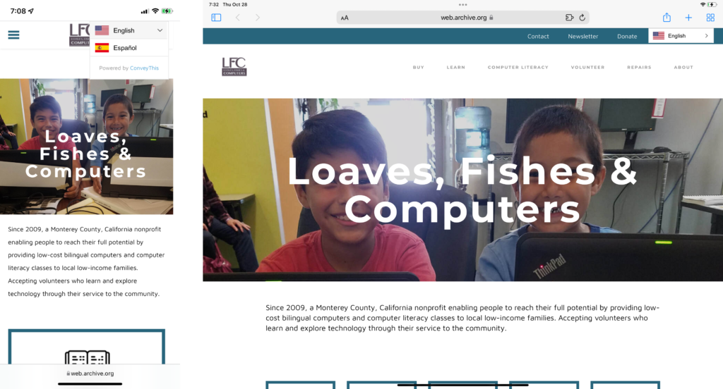
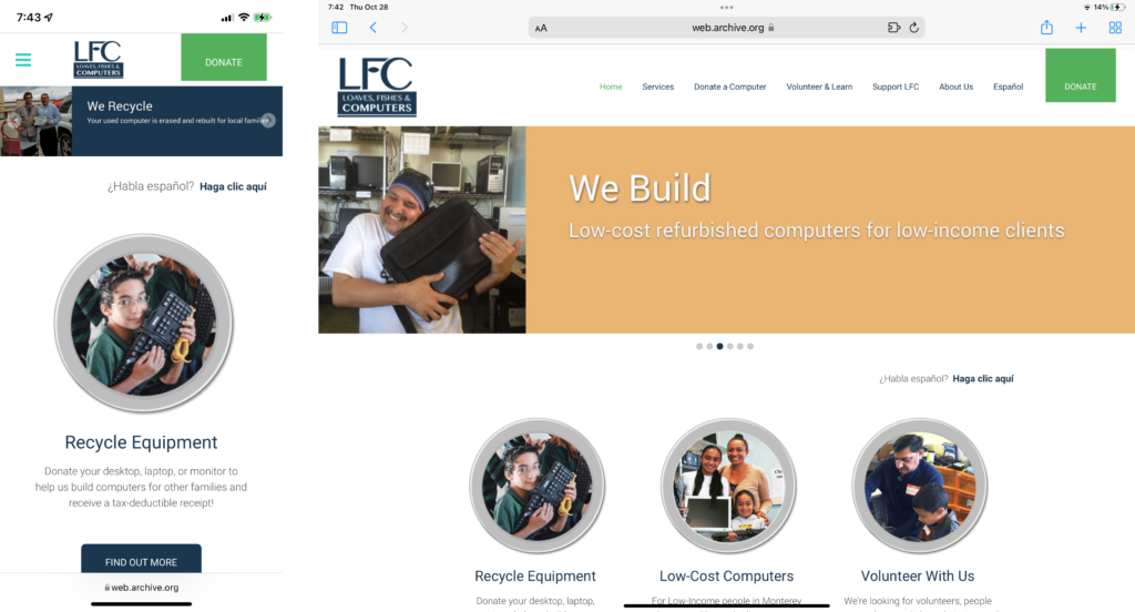
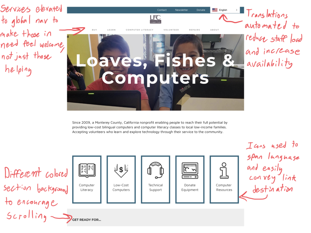
Loaves, Fishes & Computers is an organization that provides low-cost computers to low-income residents of Monterey County. LFC’s director came to my team and I asking for help to make their website easier to use.
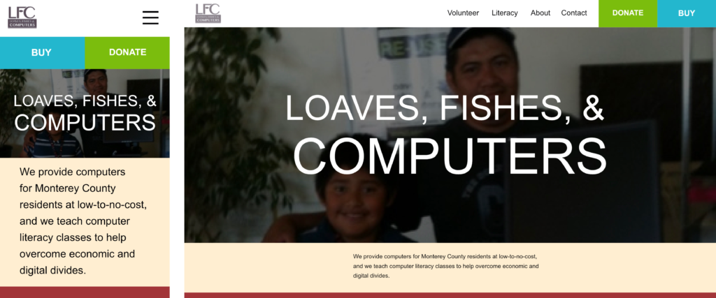
We sought to understand the organization’s goals and those of their visitors. We interviewed staff and did research on the site and its peers to find that LFC’s website needed to be more approachable, consistent, and accessible, especially for those who needed the help that they provide.
LFC Interview Takeaways
Main website functions:
- Give us time, money, computers
- Digital Literacy
- Sell computers
Main priorities for new design:
- Pleasant, consistent formatting
- Functionality
- Accessibility
I made a mistake after this point. I had my team come up with design options that increased consistency and approachability, its pleasantness, but I failed to have us start from a unified idea on what being more approachable means. What we needed was an agreed upon set of requirements that established what specifically the problems are and what our solution needs to accomplish, with model visitors that we would then test our designs on.
In the absence of all that I still believe that the changes we made continue to have a positive impact on LFC’s visitors, while understanding how we would do better and work more harmoniously going forward with a clearly defined vision.
Try visiting the site and putting yourself in the mindset of someone who needs to buy a computer, who does not have a high level of technical insight or money.